PerformancePoint Monitoring has made it really easy to build and publish basic dashboards. However designing really great dashboards is something that very few people achieve. Despite my recent post on making your reports pretty, I’m not a fan of bells and whistles – in a pre-sales/sales situation they definitely have their place – but in a production dashboard it’s hard to justify.
A dashboard needs to deliver the right information in an easy to read and and easy to interpret manner. Sounds simple right? IMO it’s easier to come up with a bad dashboard than a good one but a good dashboard maybe harder to sell than a bad one particularly when the budget holder isn’t going to be actually using it.
One of those that has mastered dashboard design is Stephen Few and I’m unashamedly going to crib from his excellent book “Information Dashboard Design – The Effective Visual Communication of Data” for this post. This is one of my favourite IT books and I urge anyone who works with any type of report to get a copy. It’s got loads of examples of dashboards and makes it clear why each is good or bad. I guarantee you will design your dashboards differently after reading; use pie charts in your reports? You won’t after reading this book!
Anyway this post isn’t supposed to be a free ad for Stephen’s book, it’s meant to give a few simple tips on making your dashboards a little better so here goes:
Don’t exceed a single screen – that bit of information that is off the bottom of the screen is less important, right? Wrong! You might even give the wrong message by leaving part of a report off the screen. Most dashboard tools make it easy to provide navigation to detail so think more about why you need to put the information together. And consider your layout – the brain naturally gives least attention to the bottom right area.
Don’t overuse colour or decorate unnecessarily – My post about adding pretty borders to your reports is a great example of unnecessary use of decoration; What value does that border round the reports really add to the user-experience? It often distracts from the real information. Does a traffic-lighted map of the UK really add any value where a bar chart is much more readable? “Dude! – your dashboard looks like a real car dashboard! coooool”. And Sacha will kill me for this but please – NO 3D charts!

Your company’s logo here? errr No thanks 🙂
Too much or too little information– By nature a dashboard is a high-level overview – you really don’t need sales figures to the penny. Consider also the context of the data you are presenting: actual sales for January may not be much use unless you can compare it to budget, forecast or previous information.
Use variety only when necessary – dashboard designers often feel compelled to use variety where variety isn’t necessary – I’m definitely guilty of this one. It’s not a crime to have your dashboard only use barchart and grids. Don’t add a Radar chart just because it will add something different.
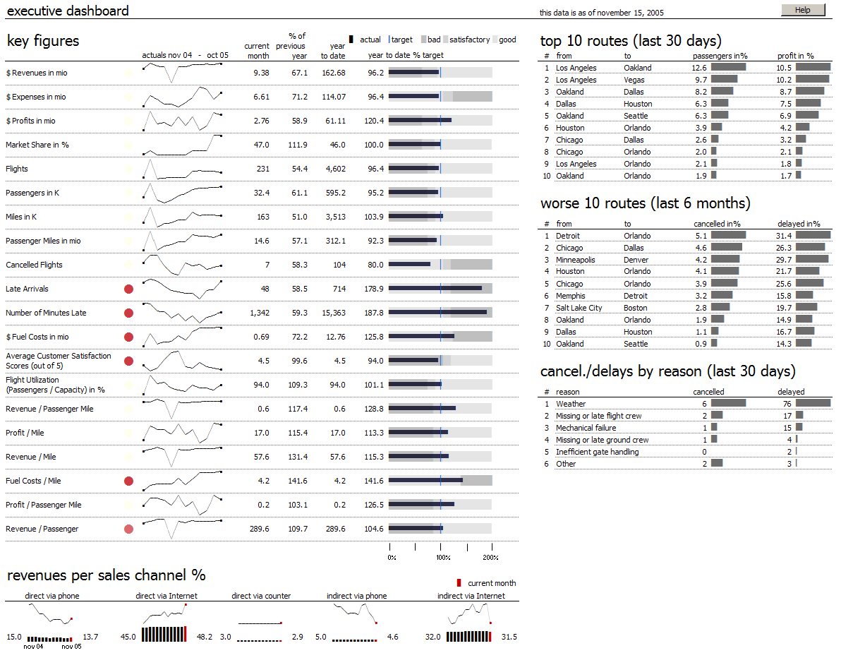
Highlight Important Data – sounds obvious but not always simple. You should be drawn straight away to the information that requires your attention the most. In the key figures area of the dashboard below you can see straight away that Late Arrivals has some issues. I particularly like the lack of a green icon against the other KPI’s.
Of course there’s so much more to it than these few points and in fact when you consider the complexity of human visual perception perhaps it’s a wonder anyone can get it right!
So what does a great dashboard look like? Well everyone has their own tastes but compare the dashboard above with the one below and make your own decisions: one is simple, clean, readable and informative! In case you’re wondering the lower dashboard was built using XLCubed.
Pareto Charts in Power BI and the DAX behind them
The Pareto principle, commonly referred to as the 80/20 rule, is a concept of prioritisation.
Apr
Databricks: Cluster Configuration
Databricks, a cloud-based platform for data engineering, offers several tools that can be used to
Apr
AI Assistance in Microsoft Fabric
The exponential growth of Large Language Models (LLMs) couples with Microsoft’s close partnership with OpenAI
Apr
10 reasons why it’s worth the effort to understand the value of your data
“If leaders really want to create a data driven culture, the journey starts with them!
Apr
Content Safety in Azure AI Studio
Azure AI Content Safety is a solution designed to identify harmful content, whether generated by
Apr
Model Benchmarks in Azure AI Studio
In the constantly changing field of artificial intelligence (AI) and machine learning (ML), choosing the
Apr
Celebrating International Women’s Day: from Classroom to Code
As we celebrate International Women’s Day, I want to share my journey of breaking stereotypes
Mar
Pretty Power BI – Adding Pagination to Bar Charts
Good User Experience (UX) design is crucial in enabling stakeholders to maximise the insights that
Feb